Introduction :
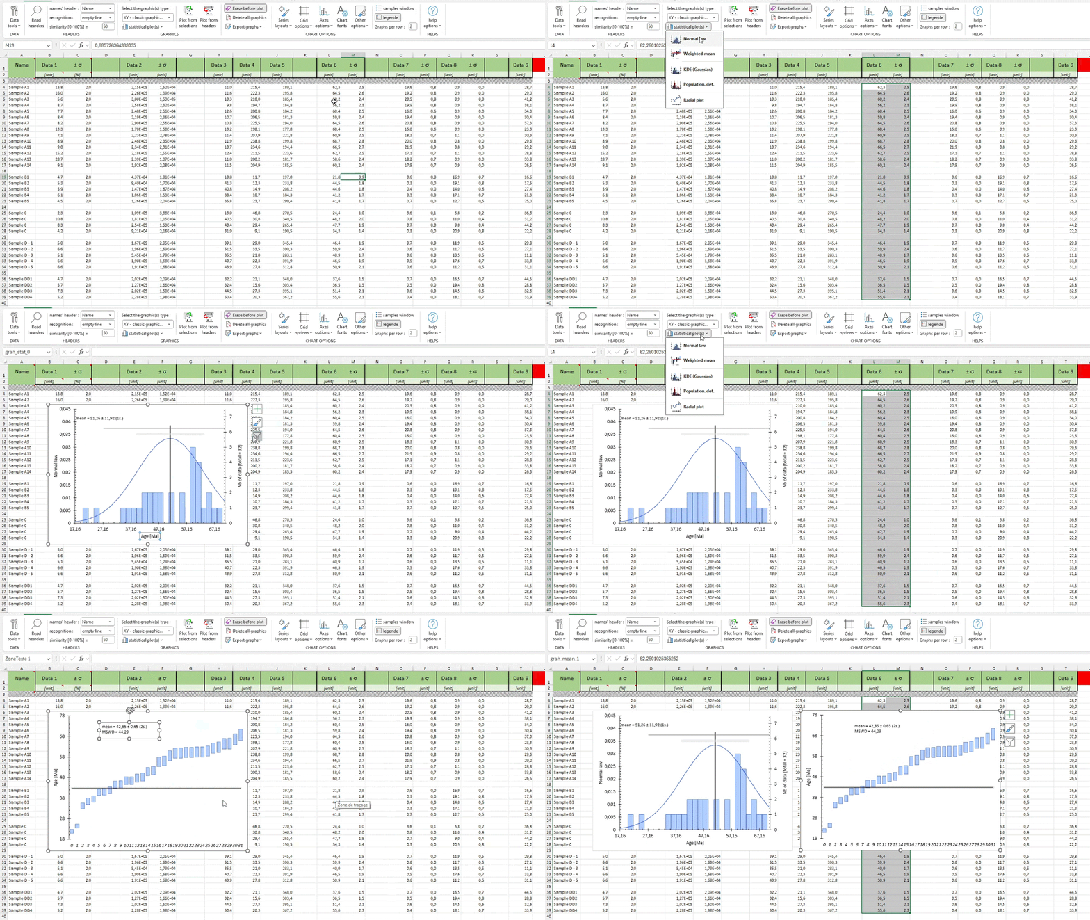
Better Plot is an Excel file based on 3 sheets (Data & Graphics, Layout and Graphics list) and a custom tab (Better Plot). Here’s an overview of the 3 sheets, which will be explained in more detail below.
- Data & Graphics: this is where you enter your data and where the graphics are generated. You can do whatever you like in this sheet.
- Layout: this sheet allows you to quickly format several different sets of data. In this sheet, you can modify the areas left blank.
- Graphics list: this sheet lets you select the graphics you want to make. All you need to do is right-click in the selection area.
Apart from these three sheets, you can use this file like any other Excel file (add a sheet, use a formula, etc.). In addition to these 3 sheets, Better Plot works on 3 basic steps, each of which corresponds to either a page or an action:
- step 1 : enter the data in the file in the “Data & graphics” sheet
- step 2 : “read” the headers of the data in the file by clicking on the “Read headers” button, choose the column containing the names of the samples and how to differentiate between the samples
- step 3 : select the type of graph and create them. There are two ways of doing this:
- by choosing the graphics to be made (X axis vs Y axis) from the “Graphics list” sheet and then clicking on “Plot from headers”.
- by selecting data directly (range A1:A10 vs range C1:C10) and clicking “Plot from selection”.
Step 1: Enter data – Data & Graphics sheets
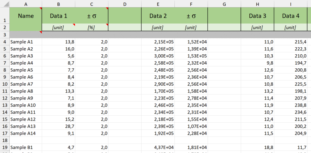
As shown in the example above, the data table (in the Data & Graphics sheet) is structured as follows:
- 1ᵉʳ row: data header
- 2ᵉ row: data unit
- 3rd row: empty
- …. rows: data
Following this structure, Better Plot recognizes data as follows:
- 1 column = 1 type of data
- 1 row = a sample / an analysis
Note that if the column header contains the character “±”, this column will be identified as an uncertainty of the data (column) to its left (e.g.: Data 1 – column B and uncertainty of Data 1 – column C) and will automatically be used to add error bars to the graphs when representing this data.
Stage 2: reading headers & recognising samples – Data & Graphics sheets
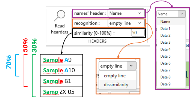
Once you have entered the data, you can click on the “Read headers” button on the ribbon to allow Better Plot to “recognise/read” your data set. Next, you need to :
- select the column containing the sample names in the “names’ header” option in the ribbon
- select the sample isolation method from the set of lines/analyses in the “recognition” option in the ribbon
There are two types of sample isolation:
“ligne vide (empty line)
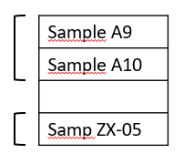
global sample name: defined by the maximum similarity of all the names (e.g. “Samples A”)
“dissimilarity
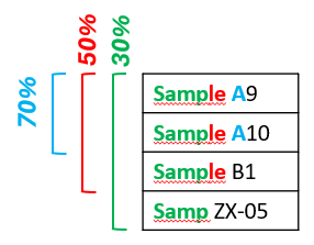
name of the global sample: defined by the similarity already established during the search
Step 3: Select the type of graph and create the graphs
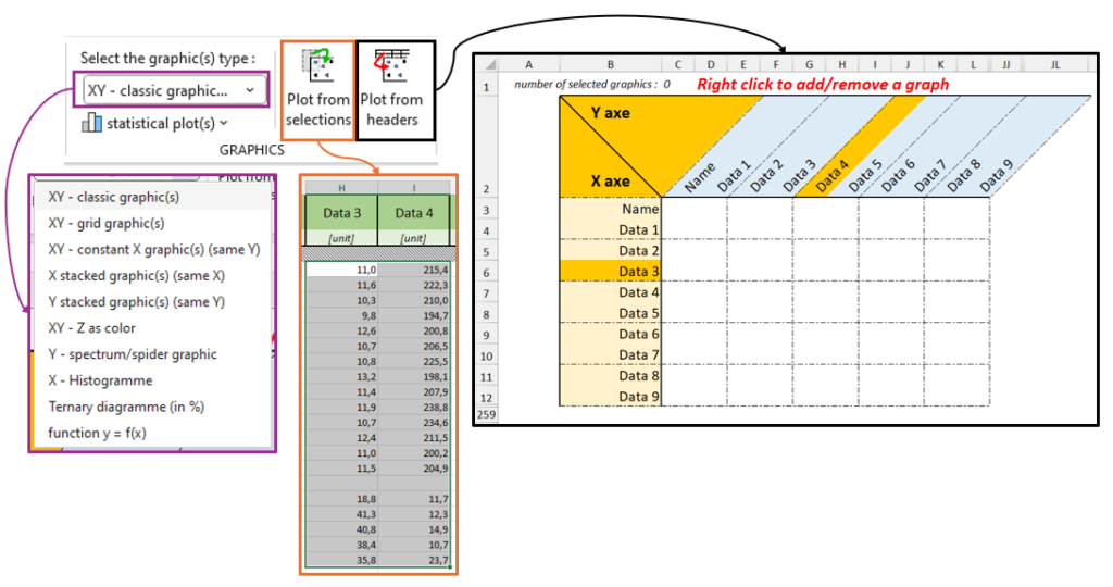
Once you have read the headers, you can select the type of graphic you want from the “Select the graphic(s) types:” option in the ribbon. You can find all the possible graphics and associated details on the next page.
You then have two options for making one or more graphics:
“Excel way” :
In the same way as for creating a traditional Excel chart, select two columns (or more, depending on the type of chart) and click on the “Plot from selection” button in the ribbon.
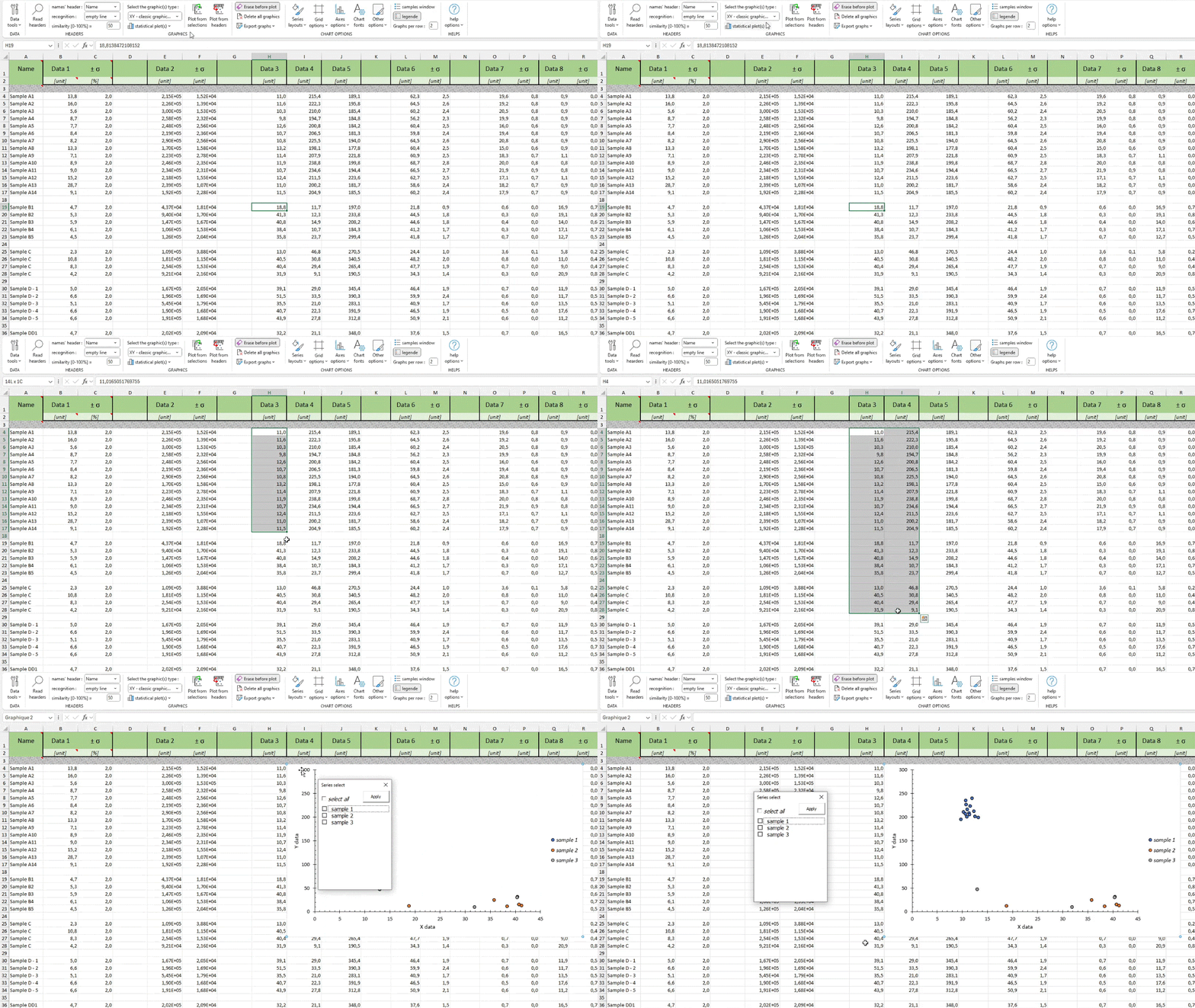
However, this method is limited and only supports the option of isolating samples with an empty line and none of the other Better Plot options (complex graph, automatic error bar, multi-graphics….).
“Better Plot” :
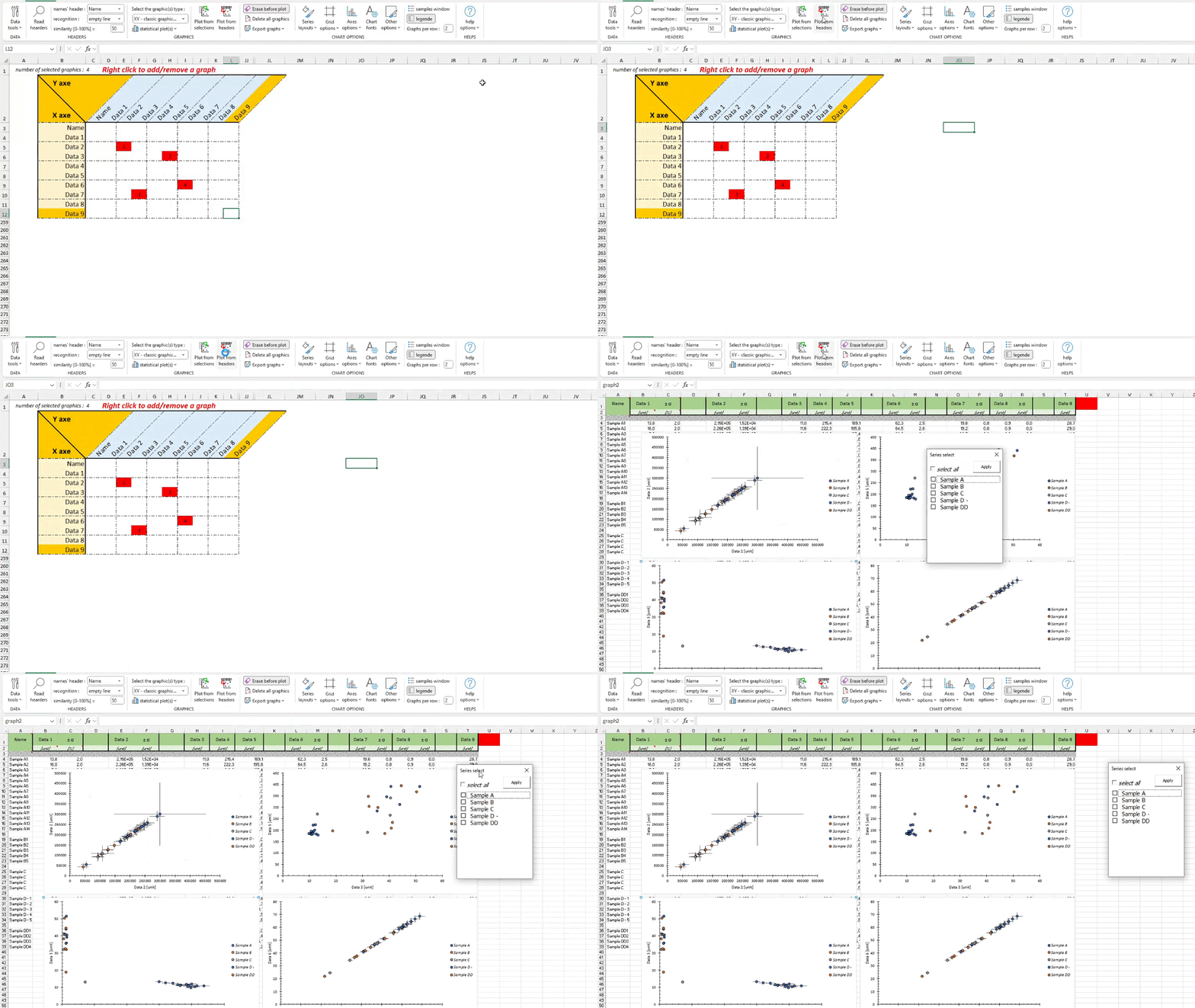
after reading the headers, the Graphics list sheet has been updated and you can add/remove the graphics you want by right-clicking in the “X axis – Y axis” matrix.
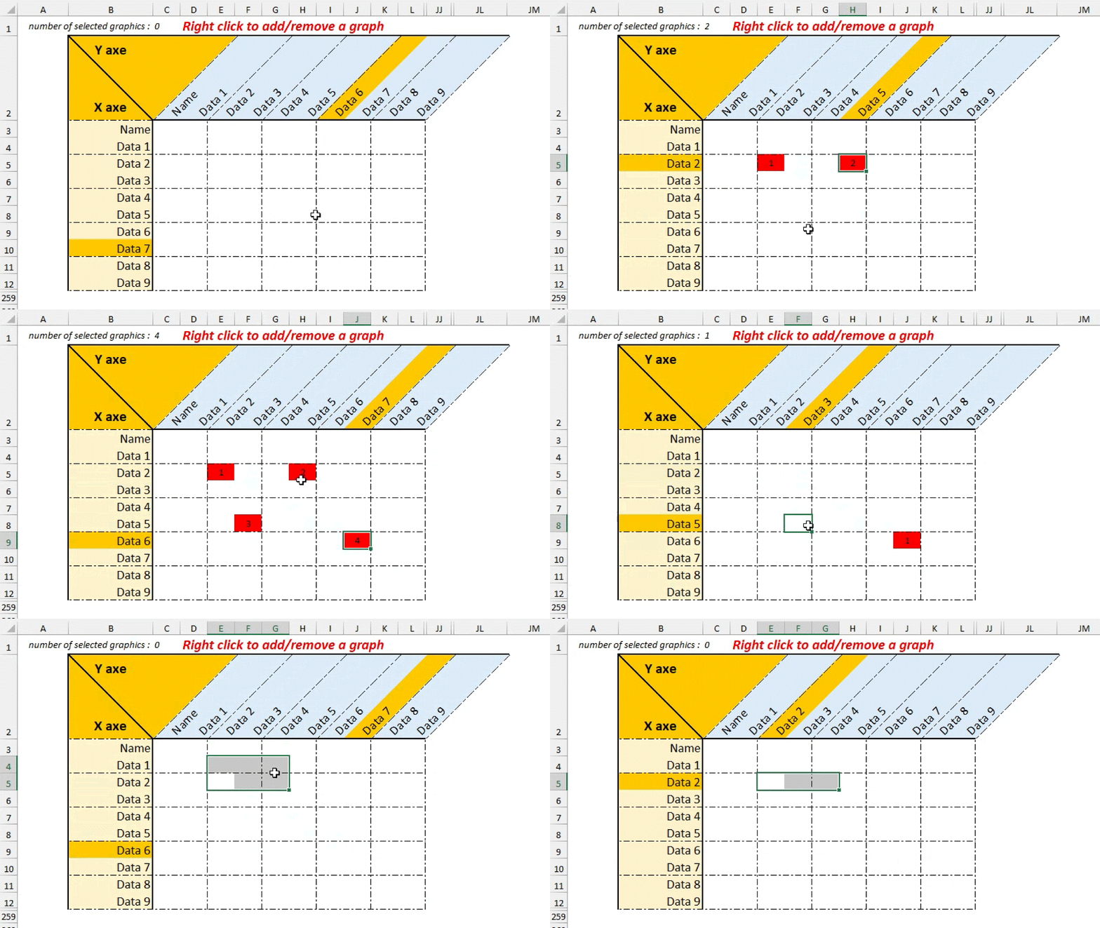
Once you have selected the graphics you want, you can click on the “Plot from headers” button in the ribbon to generate them.
Step 3bis: make statistical graphs
It is also possible to create “statistical” graphs which process a defined set of data. In this case, you need to :
- select the desired data with in 1ʳᵉ column the data (mandatory) and in 2ᵉ column the associated uncertainty (optional or mandatory depending on the type)
- select the graph you want from the “statistical plot” option in the ribbon.
- optional: select treatment parameters (see statistical graphs for more information)
