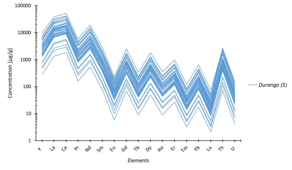


Here is a list of all the graphics that can be produced automatically, their specific features, and an example of the result obtained:
- classic XY chart
- XYZ – Z graph in marker colours
- ternary diagram (XY-Z) or double ternary diagram (XY – Z or Z’)
- stacked XY graphics
- Y / spider diagram
- histogrammes
XY Charts :
Automation:
- error bar : recognise and add error bars automatically from the data table, enter absolute values and/or percentages, and display them as a bar or ellipse. See error bars help.
- series formatting : fully automatic formatting and standardisation of series between graphs. See help on data formatting
- caption formatting : automatically from the data table
XYZ – Z graph in marker colours :
Automation:
- choice of interval: the interval can be set automatically or entered manually.
- choice of central value: optional
- colour selection: colour selection using the classic Excel interface
See the help on the XY-Z graph as colours.
Ternary diagram (XY-Z) or double ternary diagram (Z or Z’) :
Automation:
- enter data: the calculations used to construct the diagram are fully automatic
- double diagram: automatic, depending on data availability. See ternary diagram help.
Stacked XY graphics :
Automation :
- graphics calibration: automatically guaranteed perfect
- change of min-max: automatic thanks to the interactive banner. See help on stacked XY graphs
Y / spider diagram :
Histogrammes :

Automation :
- interval calculation: choice of automatic or customisable
- population calculation: automatic from the data set entered
See help on histogram charts.


