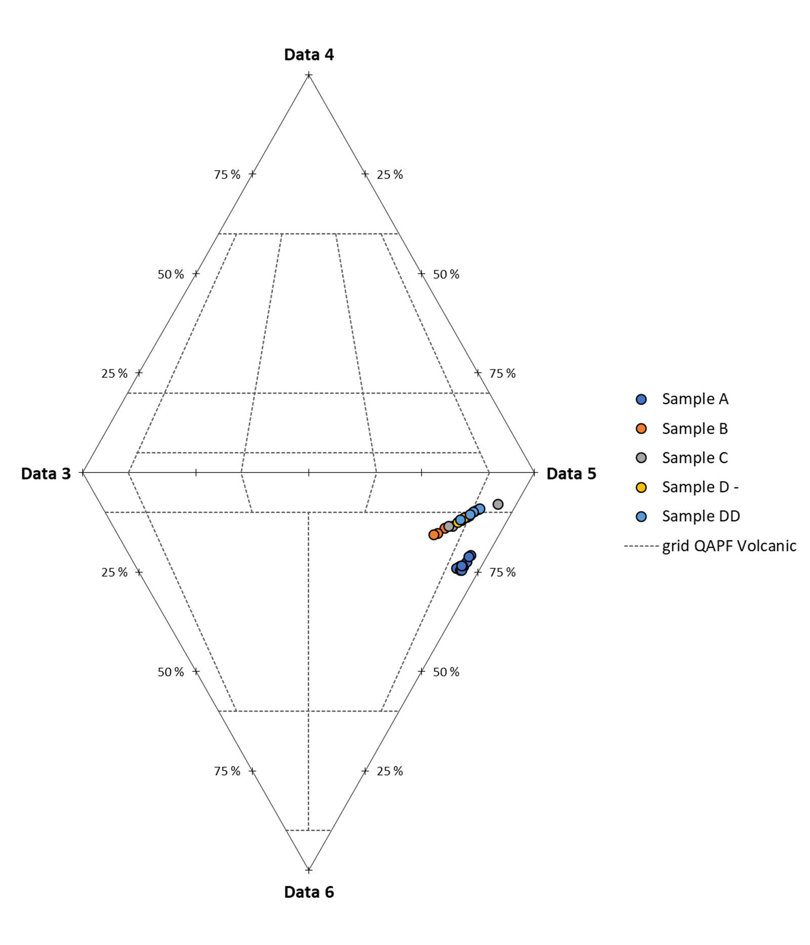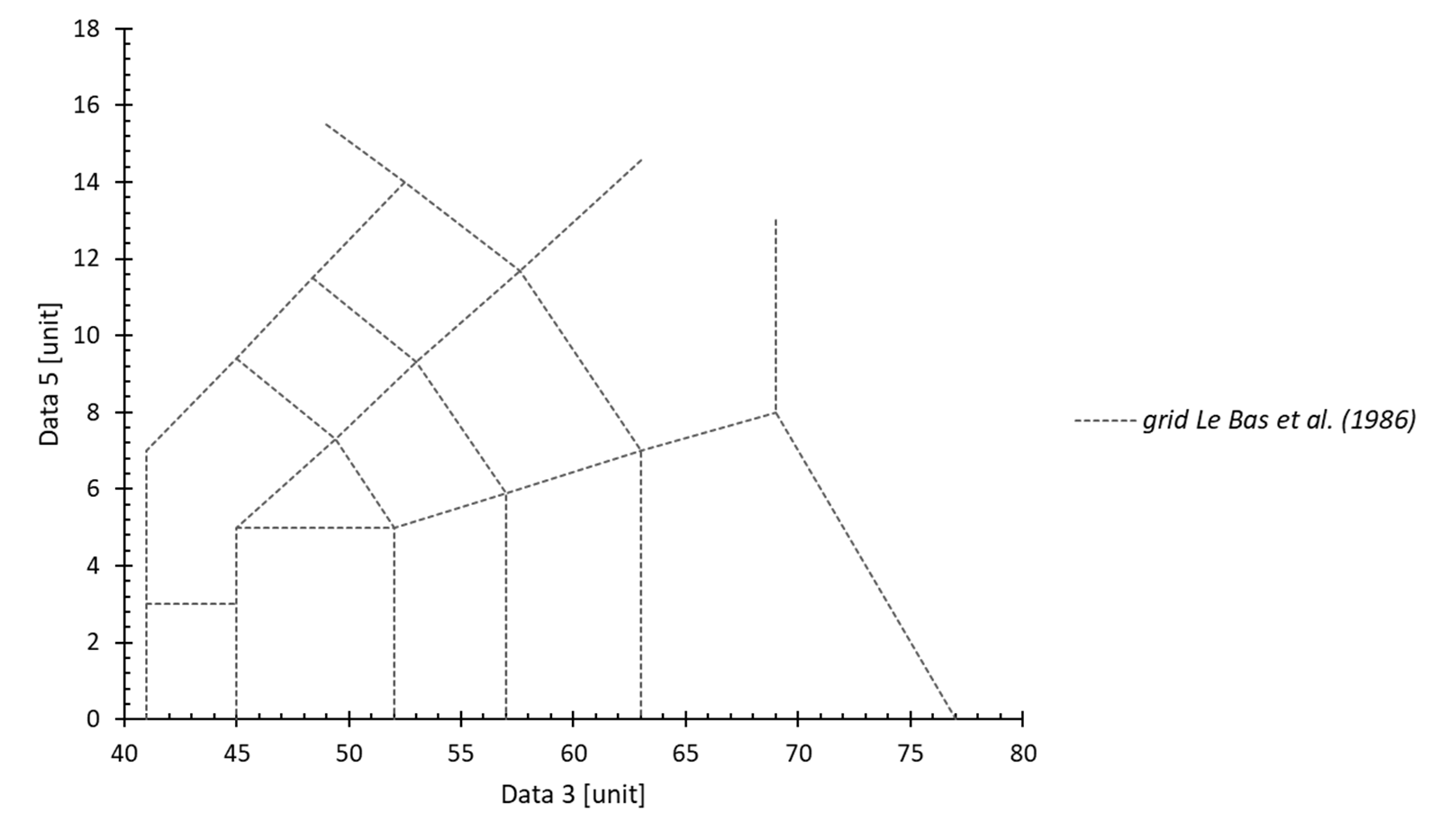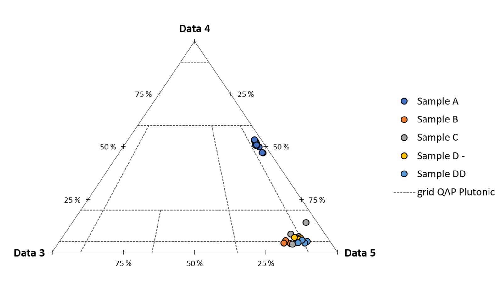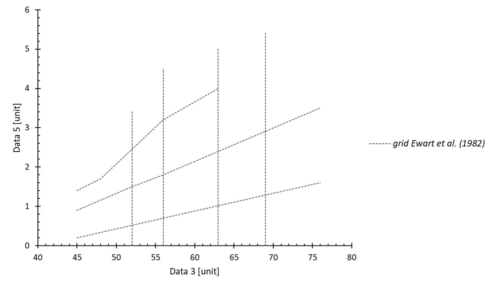


This page brings together a number of special charts, or chart options, with a high level of customisation:
- grid / zone (XY chart and ternary diagram)
- normalisation (Y chart – spider diagram)
- geological time scale (among others)
In view of the level of customisation, each of its graphics includes lists of options that are pre-integrated, but can be modified at will by users. If you feel that any of the classics are missing from these lists, please don’t hesitate to contact me.
Grid/zone integrated into a chart :
This option lets you display/add custom grids/zones to graphs so that you can represent data on a defined diagram. This option is available for XY and ternary charts.
The list of grids already included in Better Plot is available here, with many thanks to the GeoPlotter website and its creator, from whom the majority of the grids come.
How to use it :
When the “XY – grid graphic(s)” and “Ternary diagram” chart types are selected, a new section appears in the ribbon (“Opt. : grid”). This allows you to add a grid to the SELECTED graphic
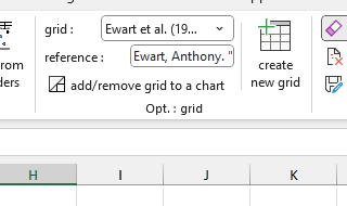
- grid: choice of grid
- reference: grid reference zone, text can be selected to copy the reference
- add/remove: ON/OFF button applied to the currently selected graph
How to create your own grid :
You can also add/create your own grids by pressing the “create new grid” button in the Opt. button: grid. This will open a new Excel file in which you can enter your grid with the following nomenclature:
- 1 “full” line (with data) = one point
- between 2 points, the grid will form a solid line
- to separate two unconnected grid segments, leave a “blank” line (no data”)
ici ajouter gif de creation
Standardisation of spider diagrams :
This option allows you to normalise spider diagrams dynamically, a classic approach in geochemistry and the geosciences more generally. The list of normalisations already included in Better Plot is available here, many thanks to F. Humbert for sharing his personal compilation, from which the majority of the standardisations originate.
How to use it :
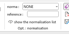
- norma: the choice of standardisation
- reference: standardisation reference zone, with the option of selecting the text to copy the reference
- show the normalisation list: ON/OFF button to display the normalisation data sheet
When the “Y – spectrum / spider diagram” chart type is selected, a new section appears in the ribbon (“Opt.: normalisation”). This allows you to normalise the data entered in the selected graph by simply changing the normalisation from “NONE” to another in the list (note: to cancel the normalisation, simply return to “NONE”).
How standardisation works :
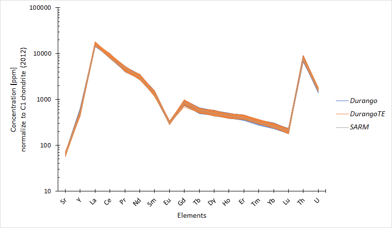
Normalisation is achieved by recognising the names of the X axis of the selected graph (which correspond to the column headings). These names must correspond to one of the headings in the Normalisation sheet (“show normalisation list” button), for example the heading “U” for the element uranium.
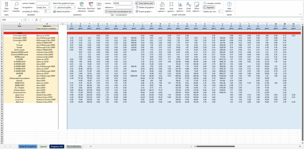
Based on this principle, you can add as many custom headers as you like to the Normalisation sheet by adding an extra column based on the same model as the others. The list of standardisations is shown below, and if you want to add more, simply add an extra row (there is no obligation to add all the columns).
